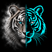

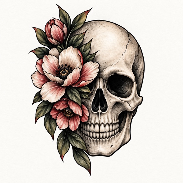
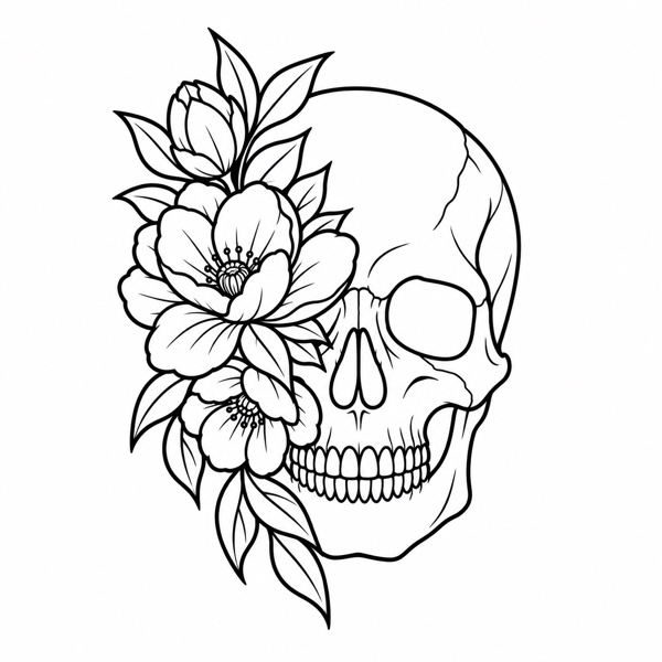
1. Start with a reference that reads clearly
A good stencil begins before you touch a slider. Choose a photo or drawing with a clear subject, visible edges, and enough resolution to inspect the details. A larger original is generally a better starting point than a small screenshot that has already been compressed.
Look at the image at the size you intend to use it. If the eyes, petals, or lettering are already difficult to distinguish, converting the image will not recover detail that is missing. Use an alternative reference or simplify the idea before spending time on fine adjustments.
Use your own artwork, licensed material, or references you have permission to adapt. A stencil conversion does not give you rights to someone else’s design.
2. Crop to the part that matters
In Stencra, choose Upload and import a reference from Photos, Camera, or Files. Open Crop to remove unnecessary surroundings, straighten the composition, or flip the image. Keeping the subject prominent gives you a clearer view of the lines you actually want to preserve.
A photograph of a drawing can contain paper texture, shadows, and objects around the page. Those details may become visual noise. Cropping removes the surroundings; cleanup and contrast can help with the remaining texture. They are not a replacement for a clear photograph.
Check lettering twice. Keep a readable master version. Mirroring for a particular transfer process belongs in print preparation, after you have confirmed which way the final artwork should face.
3. Choose the information your stencil needs
Start with Outline when you want the main contours and open interiors. If the reference depends on light and shadow, compare Tonal or Shading to see whether those cues help. Dotwork, Hatching, and Crosshatch offer different ways to describe texture.
The busiest output is not automatically the most useful one. Ask what each mark tells you: an outside edge, an internal feature, a shadow boundary, or simply background noise. Keep the information that supports the design.
Our guide to the six stencil outputs explains how to compare these options using the same reference.
4. Refine one control at a time
After generating the stencil, open Refine and compare the original with the current result. Adjust Line Weight for the strength of the contours, Contrast for separation, Detail for complexity, and Cleanup for distracting marks.
Make a small change, zoom in, then zoom back out. A heavier contour can make a shape easier to follow, but it can also close small gaps. More cleanup can remove speckles while also losing a delicate feature. Undo and Redo let you compare those tradeoffs without restarting.
There is no single set of numbers that works for every image. Judge the whole design and the smallest important details together. The goal is a readable stencil at its intended dimensions, not maximum detail on a zoomed-in screen.
5. Save, size, and check the result
Apply your refinements and save the design in My Stencils. Use folders and descriptive names to distinguish the original idea from different output choices. Preview on Body can help you explore placement on a photo; it is a visual mockup, not a guarantee of how a finished tattoo will look.
For delivery, choose PNG, JPG, PDF, or Transparent PNG. Set the physical dimensions before preparing a print. A paper test at the intended size can reveal cramped areas that were easy to miss on screen.
Before moving on, check that the whole artwork is present, fine details remain legible, any text faces the intended direction, and the printed dimensions match your plan. See our actual-size printing guide for the final checks.
About this guide
Created with AI assistance and grounded in Stencra’s documented features. This guide covers digital artwork preparation, not tattooing technique or medical advice.